Tag Archives: pattern

Rock Texture on the Shore

Some of the rocks along the shore in Larrabee State Park had worn in to interesting shapes under the relentless pressure of the sea.  The coastal rocks are all shaped by the wave action but I thought these looked a little different to normal.  I wonder whether the rocks are a softer type than I am more familiar with because the curves and cracks seemed to be a lot smoother than is usual.  Some of the rocks also had pitting in them, presumably from the eddies in the water flowing across them gradually eroding deeper into the surface of the rock.

Shock Diamonds and the F-22

Within the very high speed flows of air in an aircraft’s exhaust, you can set up a series of shock waves and expansion fans as a result of the differences between the pressure of the flow and that of the surrounding air.  When afterburner is engaged, the hot gases and the temperature changes these shocks and expansions cause, result in a diamond pattern forming in the exhaust plume.  In darker conditions, these diamonds are more conspicuous but they are visible even in normal daylight.

These diamond patterns are a function of the flow being symmetrical since most engines have round exhaust nozzles.  This isn’t the case for the F-22, though.  It has flattened nozzles with a pointed profile top and bottom.  This got me wondering what the effect is on the exhaust plume and whether the traditional diamonds are formed or whether the nozzle shape results in a different pattern of shock and expansions as they reflect within the plume.  I decided to dig in to some shots to see what I could find.

I don’t have a lot of F-22 afterburner shots.  While I have shot them a lot taking off, they often take off without afterburner.  Since they have plenty of power and burner use dramatically increases fuel consumption (and the F-22 is not over-endowed with range as it is), there is no point using burner if it isn’t needed.  Air shows are a time when they do give it plenty of burner, so that is the source of the shots.

The result of this is that there is definitely something unusual about the shock patterns.  I include some shots of F-16 and F/A-18 afterburner plumes and the normal shock patterns that create the hotspots known as the diamonds are very obvious and simple in shape.  For the F-22, things are very different with the patterns of hot zones being something more in line with the shape of the nozzle.  The way in which the patterns repeat is more complex than for an axisymmetric nozzle.  There is nothing much to conclude in these observations.  It is just something that appeals to an old aero guy like me.

Drainage Patterns in the Sand

Walking along the beach at Tofino, you see some interesting patterns in the sand.  He movement of water across the sand causes various ridges in the surface.  There is also water draining down the beach from the land behind the beach.  This water gathers behind the ridges but ultimately needs to drain further.  When it finds a weak spot, it cuts through the ridge.  Once it does so, the water all flows through this breach and it starts to take some sand with it.  It expands the cut and then deposits the sand further down as it slows down again.  This can result in some cool formations in the sand.

Lightroom 8.2 Detail Enhancer

Updates to Lightroom come along relatively regularly and they tend to include new features along with fixes and performance tweaks.  The latest update, Lightroom 8.2, includes a new addition called Detail Enhancer.  This is a feature that is designed to provide some better small-scale detail as part of the raw conversion process.  It creates a new DNG file based on a more complex calculation of the demosaicing of the sensor data.

I saw some videos about it and figured it wasn’t going to be of much use for the type of thing I am working on.  However, it did trigger one possible area of interest.  The algorithms are supposed to be designed to make better calculations around the different color pixels that sensors have.  Sensors are set up in a Bayer Pattern where different color sensitive sensors occupy different pixel spaces.  They each record in one color and then software interpolates between them to create colors for each pixel irrespective of which color was originally recorded at that location.

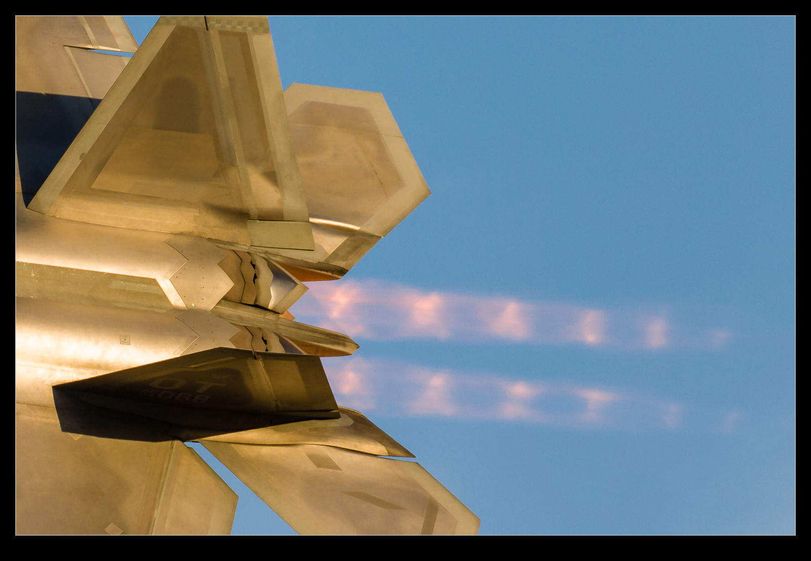
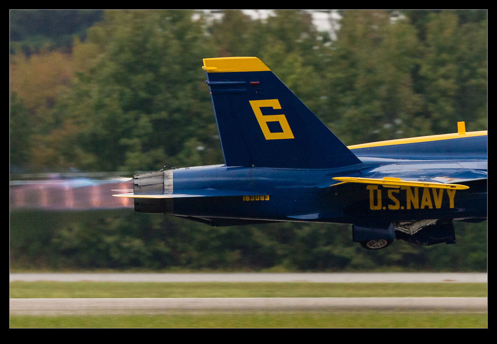
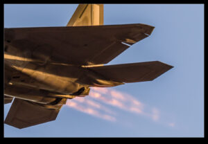
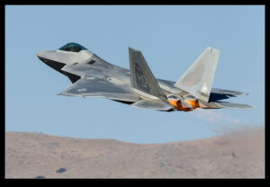
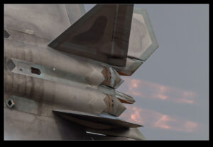
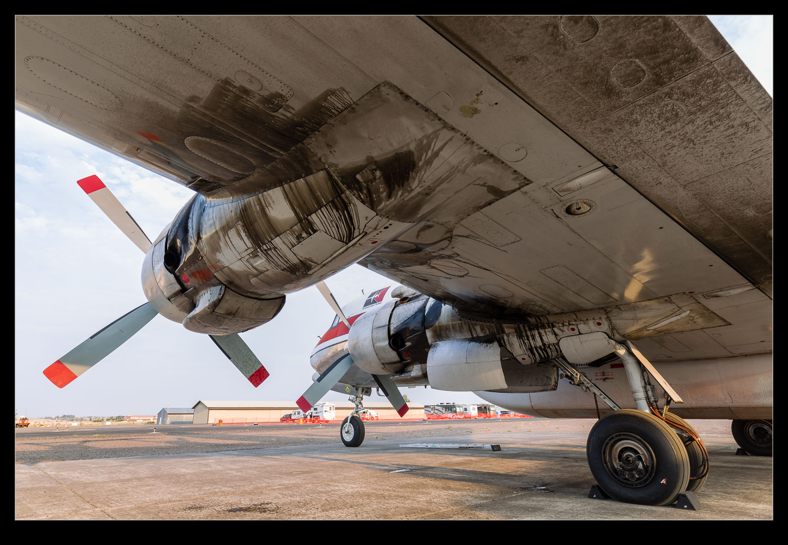
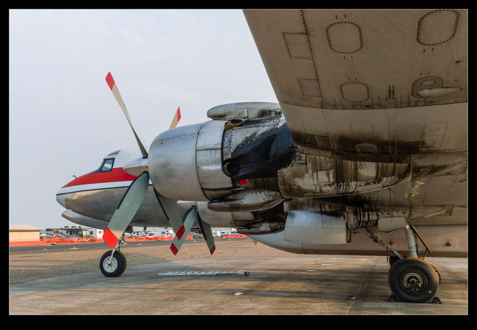
In a post from a while back, I mused on the way in which the colors of the Southwest Livery and the registration clashed and seemed to provide a distorted image even when everything around them was sharp.  I was pondering whether this was artifacting caused by the different colors and the way the sensor was recording the data.  If this was the case, maybe this new functionality would change the way things were rendered.  I dug out a few of the shots that had previously demonstrated this effect and ran the process on them.  These shots show the wide shot, the original rendering of the close up and the revised rendering using Detail Enhancer.

As you can see from the comparisons, Detail Enhancer does not suddenly render a perfect registration for the aircraft.  However, to my eye at least, it does appear as if the results are noticeably better then they were with the original rendering.  For completeness, the original rendering is done with the latest process version of Adobe’s raw converter to make things as fair as possible.  It does appear to make a difference.  This makes me think my theory about whiny things looked wrong might have some merit, even if this update has not fully resolved things.
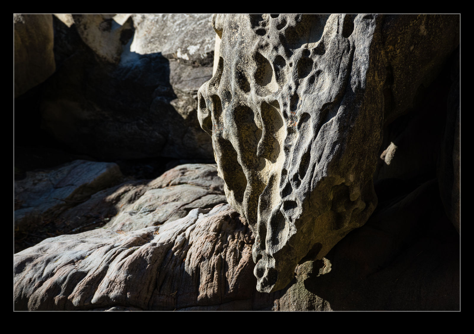
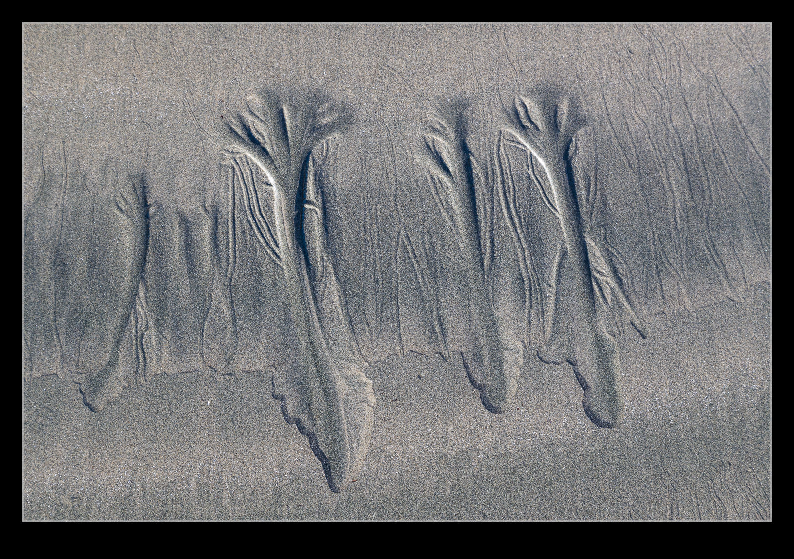
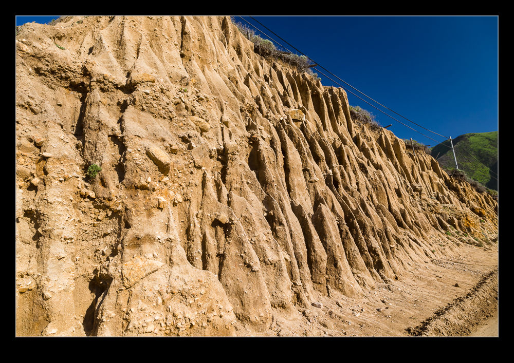
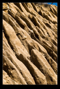
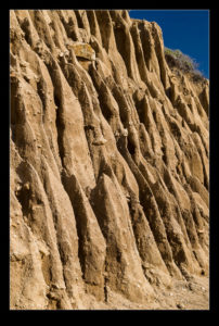
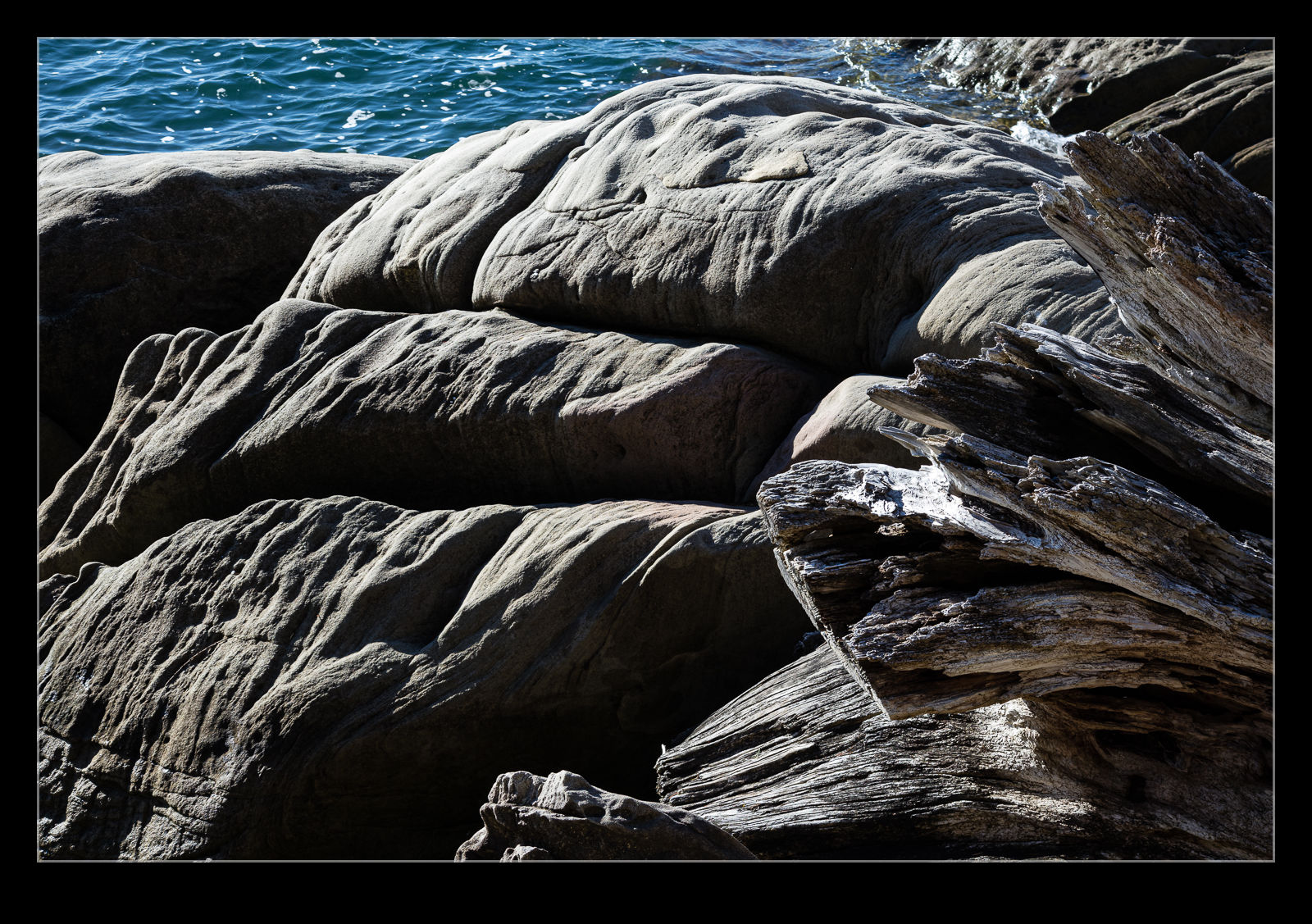
Freeway Interchange

Dallas is a place that has a lot of highways.  Big highways and smaller ones but lots of them.  The interchanges take up a lot of space but I guess in Texas you have a lot of space.  The patterns of an interchange are best appreciated from the air.  In this case it was the window of an Alaska jet heading in to Love Field so not the ideal platform but it did quite a good job all the same.

Sensor De-mosaicing and Southwest Colors

I have been pondering the way in which the method by which digital images are captured is affected by what is being photographed.  As part of my workflow, I render 1:1 versions of the images and then quickly weed out the ones that are not sharp.  This needs you to be able to see some detail in the shot that shows whether the sharpness is there.  I have found that, if a Southwest Airlines 737 is in the new color scheme, something odd happens.

Digital image sensors actually capture one of three colors.  Each pixel is sensitive to a certain color – either red, green or blue – courtesy of a filter.  They colors are arranged on the sensor in a pattern called a Bayer pattern.  The camera then carries out calculations based on what the pixels around each location see to calculate what the actual color should be for each location.  This process is known as de-mosaicing.  It can be a simple averaging but more complex calculations have been developed to avoid strange artifacts.

When I photograph the new Southwest scheme, something strange occurs around the N number on the rear fuselage.  It looks very blotchy, even when every other part of the airframe looks sharp and clear.  I am wondering whether the color of the airframe and the color of the registration digits are in some way confusing the de-mosaicing algorithm and resulting in some odd elements to the processed image that weren’t there in real life.  If any of you have photographed this color scheme, can you see whether you had something similar and, if you did or didn’t, let me know what camera you were shooting with so we can see if it is manufacturer specific or not.

Abstract Earth Erosion

Driving south on the Pacific Coast Highway, I was quite taken by the patterns in the earth resulting from erosion by the rain.  The soil is obviously soft and so has worn in patterns that are quite striking.  I think we were driving south when the light was best for the patterns.  The shadows were very pronounced.  On the way back I stopped to take some shots.  They were interesting but the light had moved to be more head on so the contrast was not as pronounced.  However, I still think the shapes made some interesting abstract patterns.

Millennium Bridge

C59F0252.jpgI don’t think I need to let you know when the Millennium Bridge was built. It had a tricky history with the initial configuration experiencing some oscillations as the number of people walking on it increased which resulted in it getting some nicknames involving wobbling. Modifications were made and it is now a great addition to the river. Since it is a pedestrian bridge that connects St Paul’s with the South Bank at Tate Modern, it is very popular.

C59F0238.jpgI find the shape of the bridge very interesting. The cable arrangements that support the bridge are very cool and the ramps at each end add to the interest. While we were there, a few people were using it as a location for filming their own activities which requires them to ignore the vast number of people who are invading their scene! I like the number of people that are there since it really gives an impression of just how popular a bridge it is.

C59F0253.jpg

Is There Any Oil in This Thing?

C59F8061.jpgParked up on the ramp at Erickson’s facility was a DC-7 tanker. It didn’t move while we were there so it became the target of a number of photographers at any one time. I shall show more of it shortly but one thing that caught my attention was the amount of oil on the engine nacelles. Old piston engines are well known for consuming oil at a prodigious rate and this beast was no exception. It seemed to have done a great job of relocating the oil from the internals of the engines to the outside of the nacelles. It made for some great patterns and this was what distracted me for a while as I walked around the aircraft.

C59F8060.jpg

Strange Branch Texture

AU0E4161.jpgAs we wandered around the botanic garden in Balboa Park, I was quite interested in a plant that had branches with an odd oval shape repeated across their surface. I mentioned it to Nancy and she had seen something similar in another part of the garden but that had been cut off. The cross section of the branch was more interesting than the surface apparently.

AU0E4181.jpgWe spent a short while hunting for where she had seen this before and when we found it, she was proved correct. The outside of the branch had the same pattern as I had seen earlier. The inside was certainly unusual. Rather than try and describe it, I shall just let you take a look for yourselves.