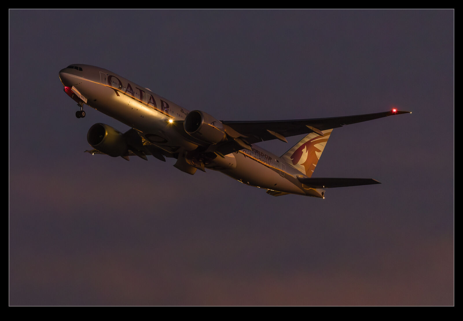
I will freely admit I am as much of a gearhead as the next photographer. New toys always catch my attention and then it is a matter of time before the battle is won between my sensible side or my not very sensible side as to whether I am going to get something. The price of said item may well have an influence on which side wins that battle.
One thing that is a popular discussion for the pixel peepers is noise. Having started off with a Canon EOS10D when I first went digital and worked through a number of bodies since – none of which have left my ownership I must confess – I have seen some steady improvement in noise reduction capabilities although not always with as much benefit to the final image as I might have liked but I digress.
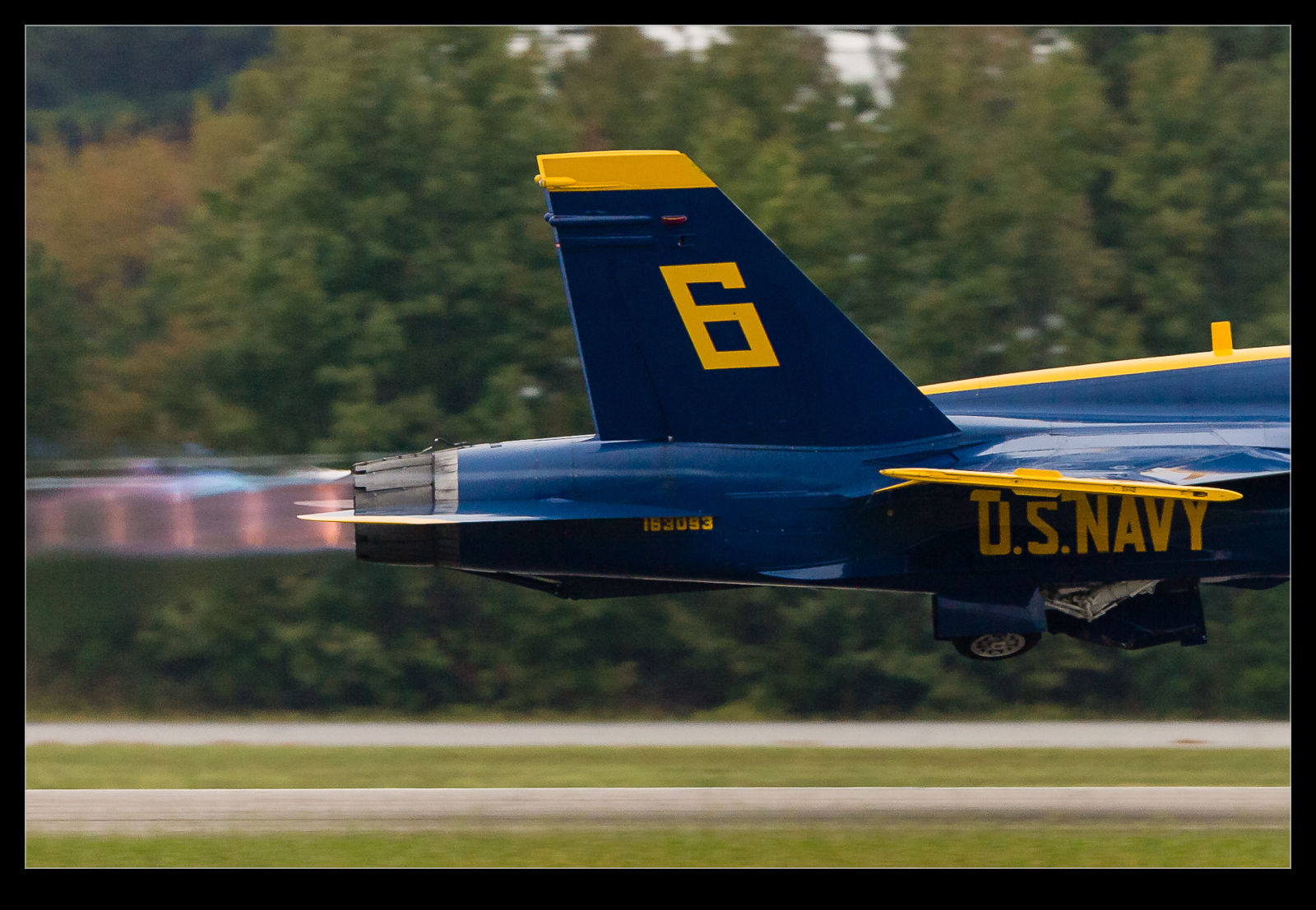
A while back I was shooting at the Oceana air show with two of my buddies, Ben and Simon. We had trekked down from DC for the show and were greeted by less than ideal weather. The cloud base was solid and low and a bunch of displays didn’t take place. Some did though and we still had a good day. Given the heavy cloud, though, we were struggling for light. I was shooting mainly with the MkIIN and was up at ISO 800 for a lot of the time.
The MkIIN is well into the noisy range at 800 and I knew that was the case but there was little option. A while after this show, Lightroom 3 came out and it had a lot of noise reduction built in that wasn’t in the previous version. I took a look at some of the Oceana shots to see how much better they might look. There was a noticeable improvement and I was happy.
Why am I discussing this now, over a year later? I was mulling over this topic for some reason, probably related to another acquisition decision, and I wondered how the printed version was affected by this noise. There are plenty of things that I fret over in an image when looking at it on screen, usually zoomed in far too close, that really don’t become apparent at all when printing. Is noise one of those things that looks better on paper?
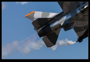
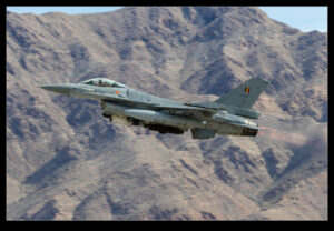
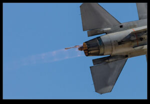
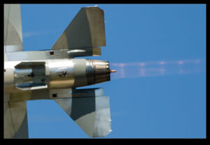
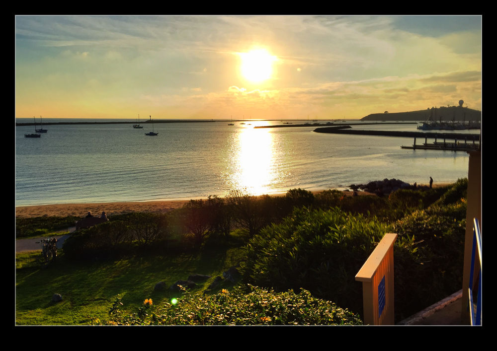
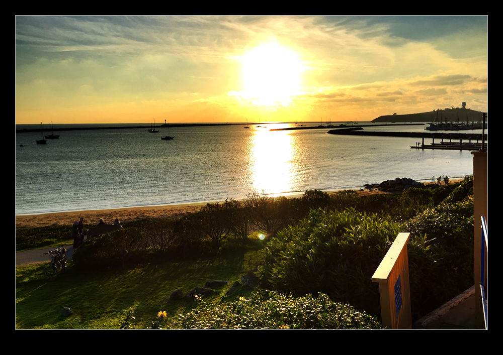
 I picked one of the shots from that day to experiment with. The shot in question is this one of one of the Blue Angels taking off. Since there was the treeline behind, the gray sky was not an issue and the burner plumes show up nicely given how dark it is so I like the shot. Now to check it out on a print.
One of the nice features of Lightroom is the ability to mess with the print layouts. I made a couple of virtual copies of the image and one one of them did my best to optimize the noise reduction and on the other switched it off for the most part. On screen, it did not look great. I then set up a page in the print module with two cells right next to each other and put the left side of one image in the left cell and the right side of the other in the right cell. It looks like a full aircraft if I get the positioning just right.
First I printed it on an 8.5×11 sheet. If I look closely, I can see the divide. It actually shows more in the background than on the aircraft. It is visible but it isn’t as noticeable as you might expect. This had got my interest! What about the size of the print. I repeated the layout on some Super B (13×19) paper of the same type and printed it again.
As you might expect, this time is is a little more noticeable – hey, it’s twice the size! However, even now, while it isn’t great, it really isn’t that bad. We are talking about turning the NR almost off.
So, what do I conclude from this? Well, technology is going to always get better, both in camera and on the computer processing it and I am still going to be a sucker for a new piece of kit. However, while there is a noticeable noise difference on screen, the print is really a lot more forgiving. Maybe I should relax about it a lot more and just enjoy the shooting, even when the light is limited.
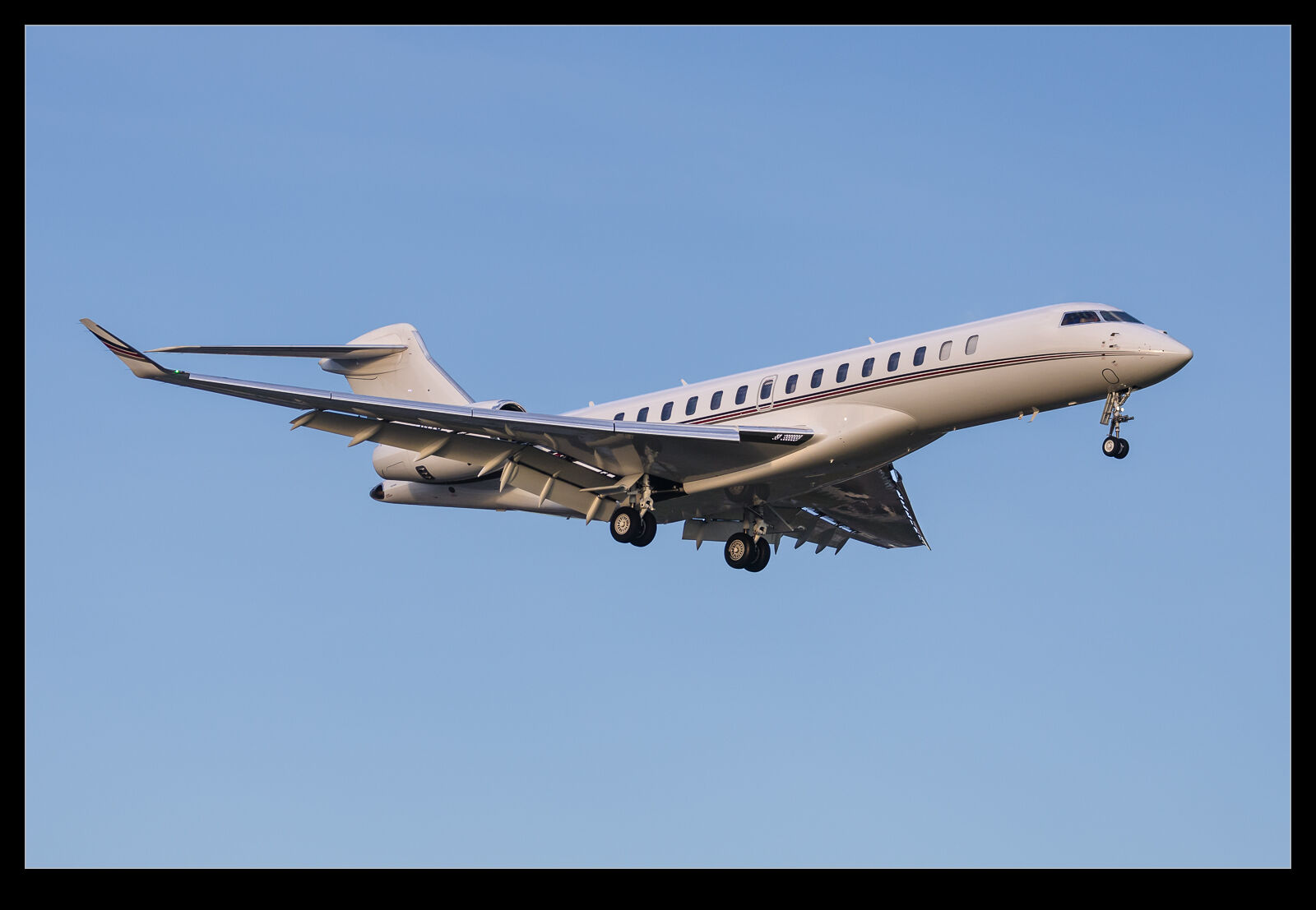
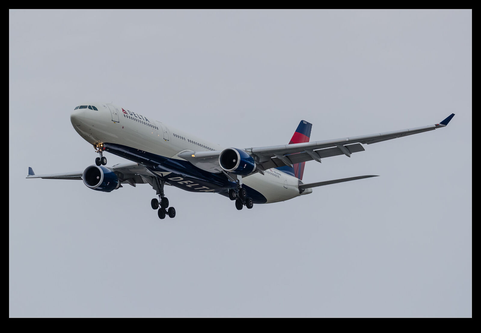
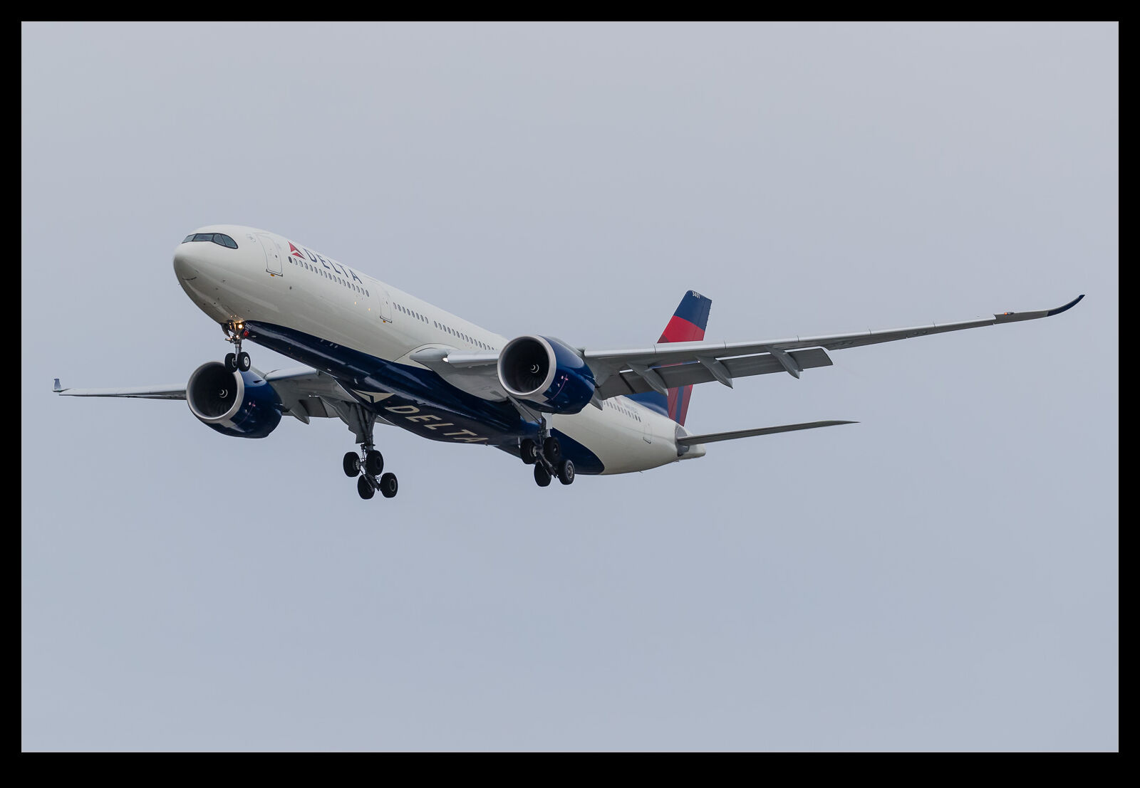
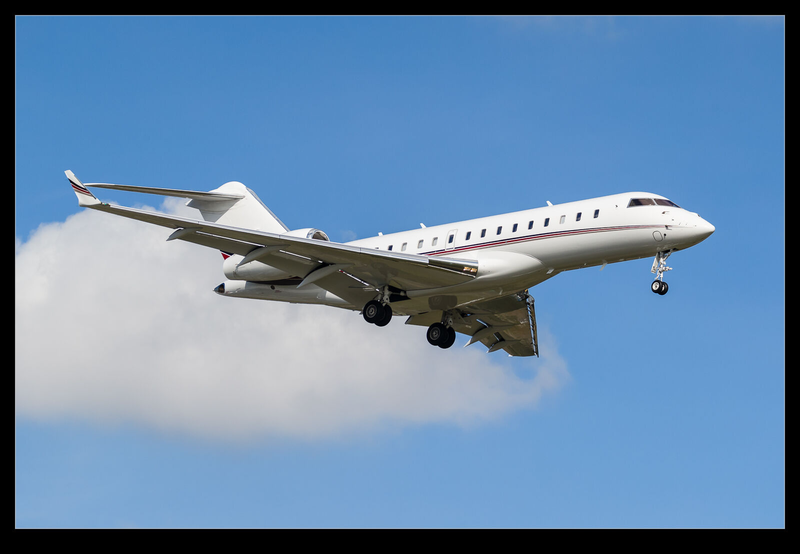 When Bombardier launched the Global 7500, I was quite keen to see them. My friend was the engineering director on the project and, despite me giving him crap at every opportunity, I think he probably did a good job on this one. Sadly, I haven’t shot as many 7500s as I would have liked. Global 6000s, on the other hand, I have shot plenty of. There have been a few, though, so I decided to see what the obvious visual differences would be.
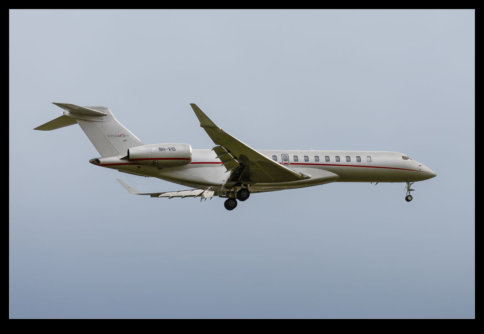
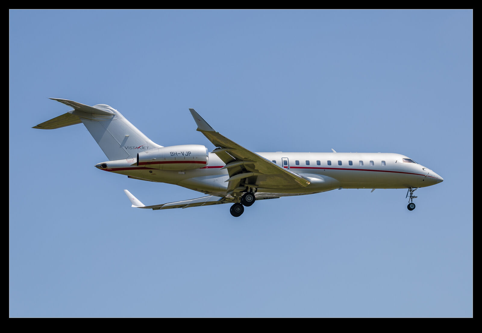 With some bizjets, counting windows is the way to know. That rarely helps me out as I can never remember what the appropriate numbers are. For the 7500, though, I think the windows look very different. They seem to be a lot larger and squarer. That is a bit of a giveaway. Then there is the fin top. The 7500 has a more angular top to it which actually looks a bit like some of the CRJ versions. Last, there are the flaps. The 7500 flap system seems to be more complex than that of the 6000. I have included images of NetJets and VistaJet examples of both types at similar angles for comparison. See what other differences you spot.