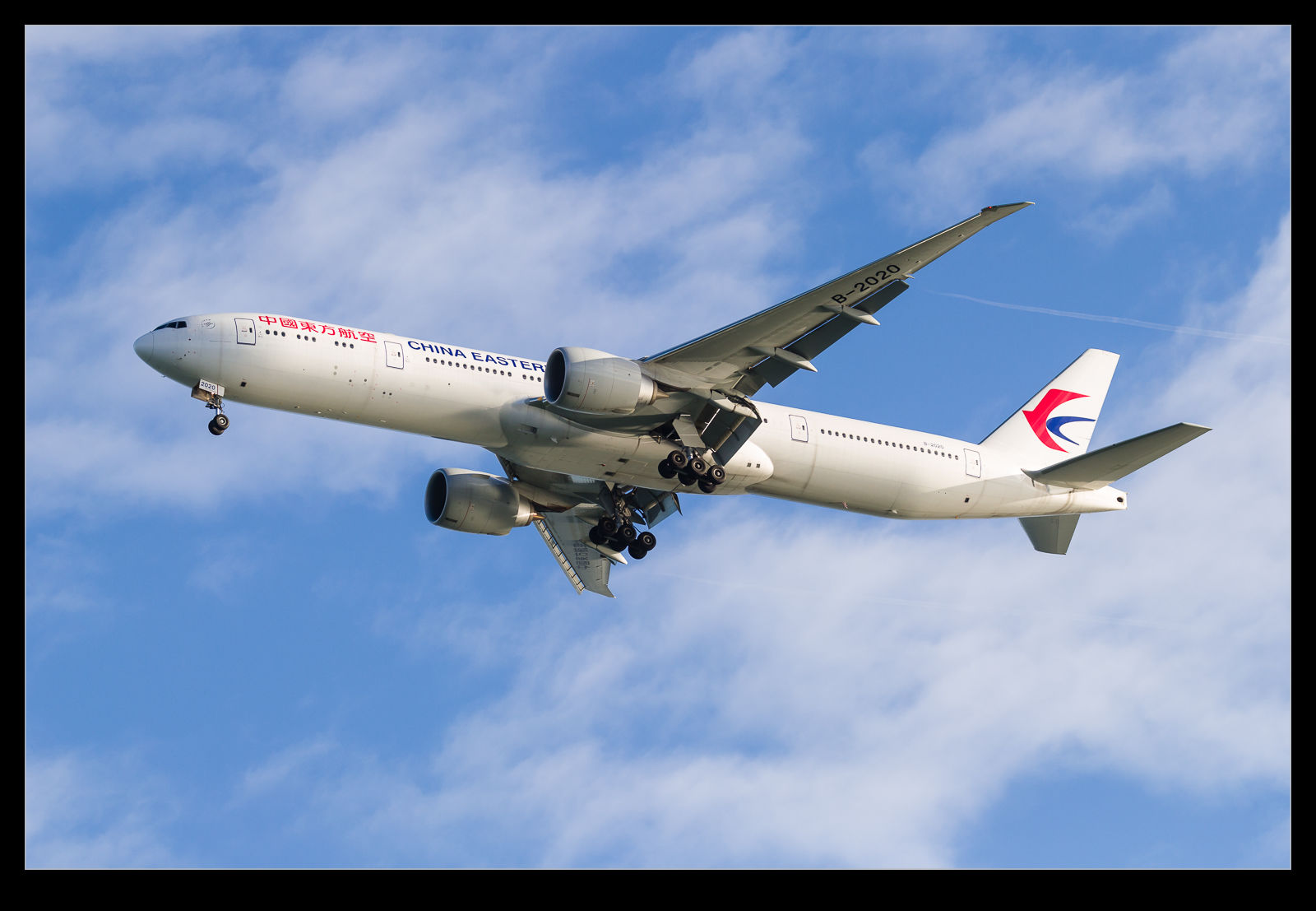
Updates to Lightroom come along relatively regularly and they tend to include new features along with fixes and performance tweaks. The latest update, Lightroom 8.2, includes a new addition called Detail Enhancer. This is a feature that is designed to provide some better small-scale detail as part of the raw conversion process. It creates a new DNG file based on a more complex calculation of the demosaicing of the sensor data.
I saw some videos about it and figured it wasn’t going to be of much use for the type of thing I am working on. However, it did trigger one possible area of interest. The algorithms are supposed to be designed to make better calculations around the different color pixels that sensors have. Sensors are set up in a Bayer Pattern where different color sensitive sensors occupy different pixel spaces. They each record in one color and then software interpolates between them to create colors for each pixel irrespective of which color was originally recorded at that location.

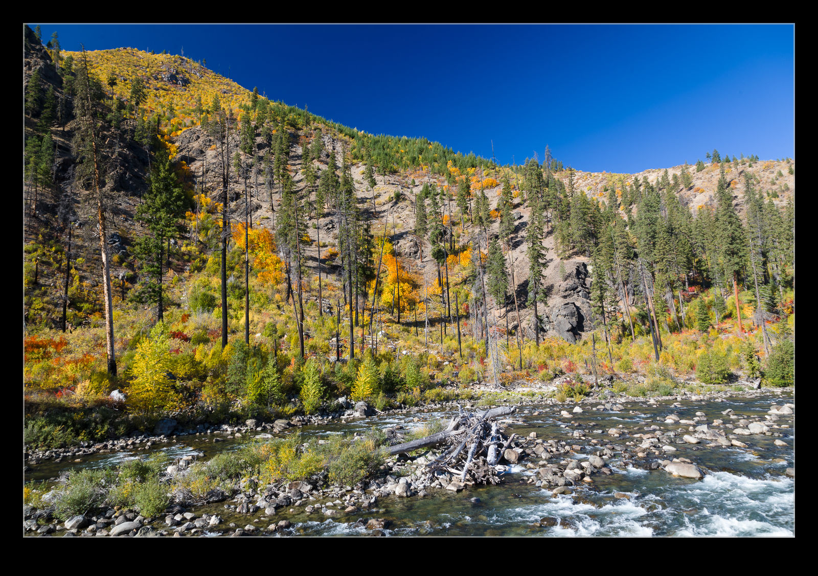
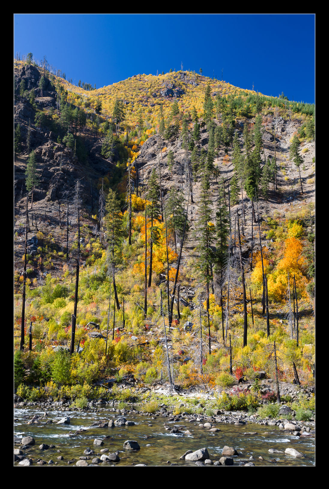
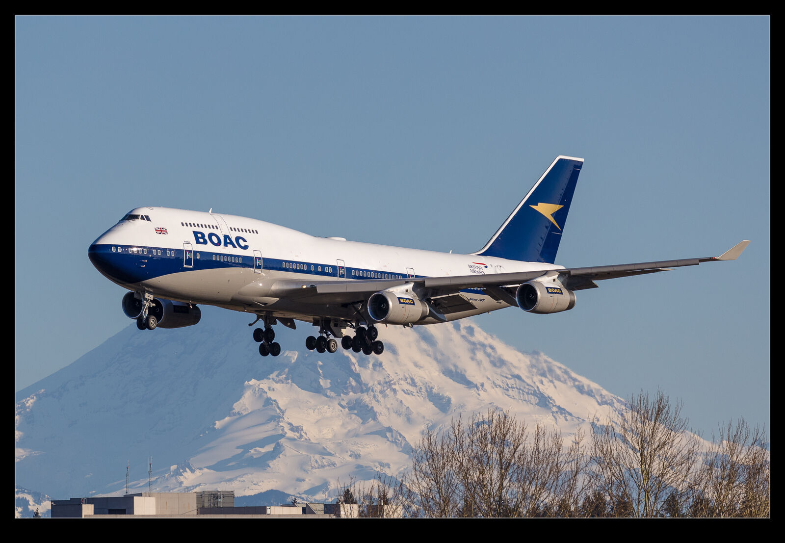
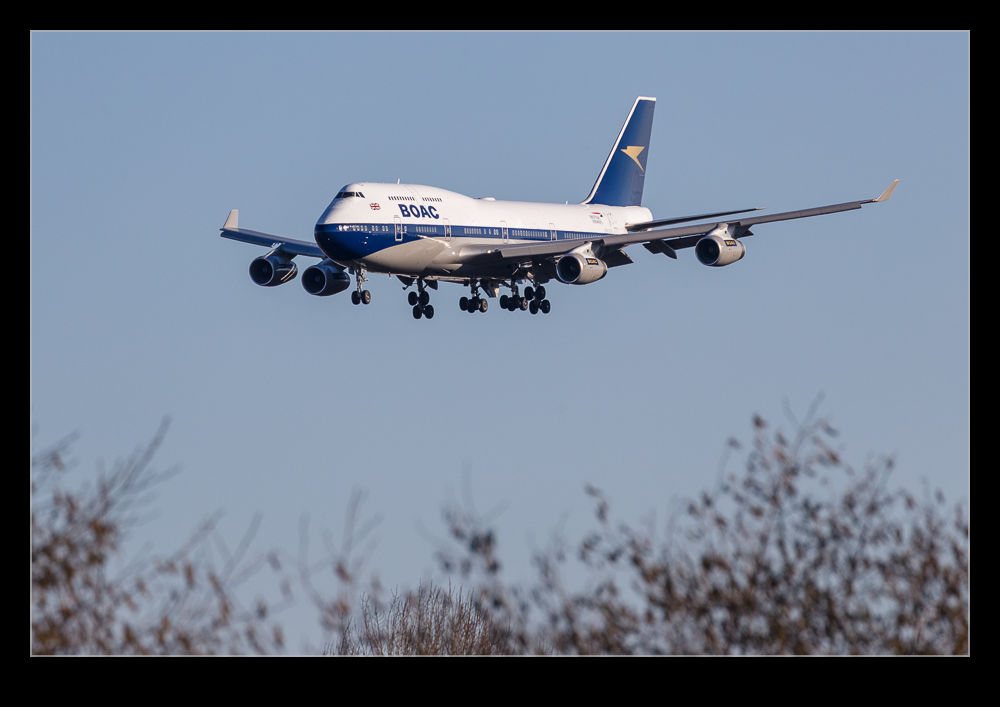
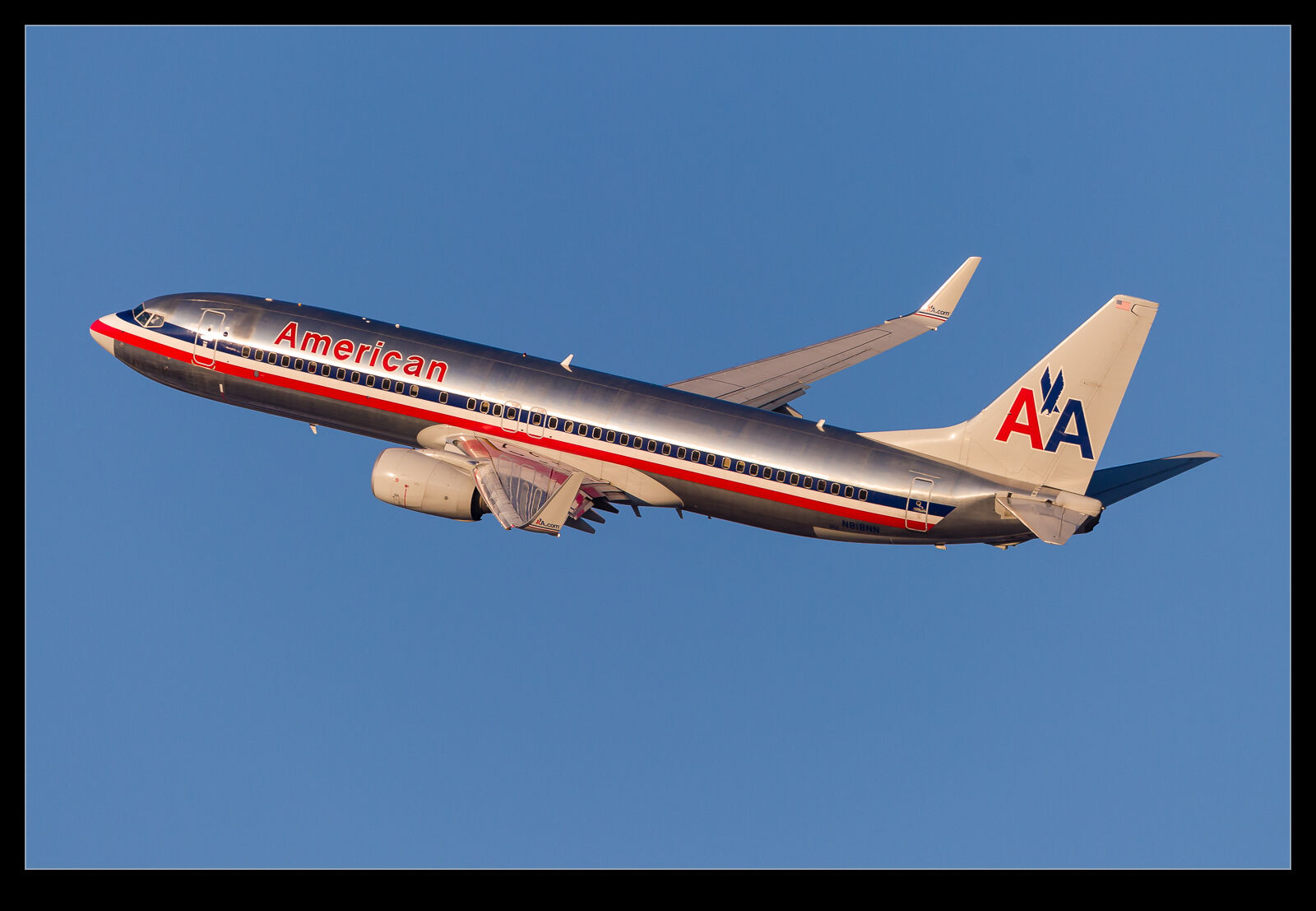
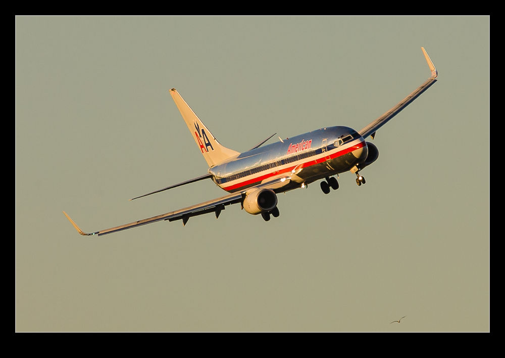
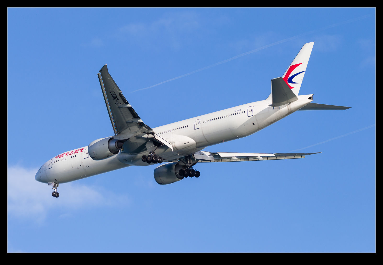
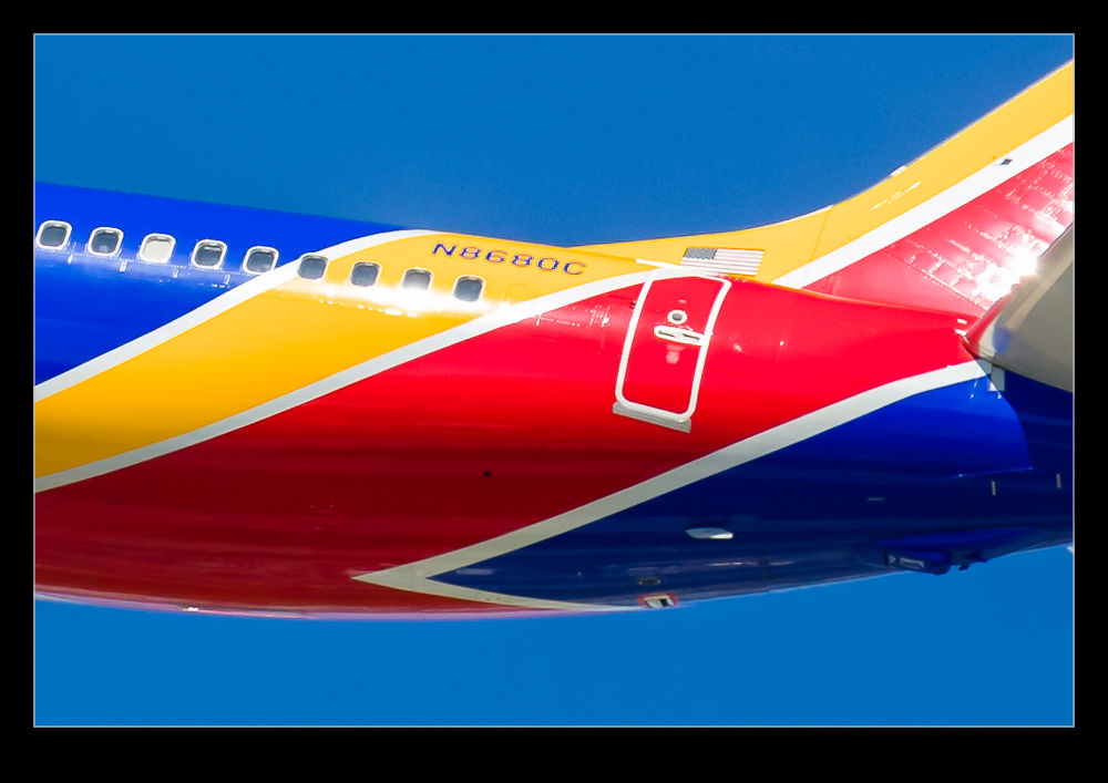 In a post from a while back, I mused on the way in which the colors of the Southwest Livery and the registration clashed and seemed to provide a distorted image even when everything around them was sharp. I was pondering whether this was artifacting caused by the different colors and the way the sensor was recording the data. If this was the case, maybe this new functionality would change the way things were rendered. I dug out a few of the shots that had previously demonstrated this effect and ran the process on them. These shots show the wide shot, the original rendering of the close up and the revised rendering using Detail Enhancer.
As you can see from the comparisons, Detail Enhancer does not suddenly render a perfect registration for the aircraft. However, to my eye at least, it does appear as if the results are noticeably better then they were with the original rendering. For completeness, the original rendering is done with the latest process version of Adobe’s raw converter to make things as fair as possible. It does appear to make a difference. This makes me think my theory about whiny things looked wrong might have some merit, even if this update has not fully resolved things.
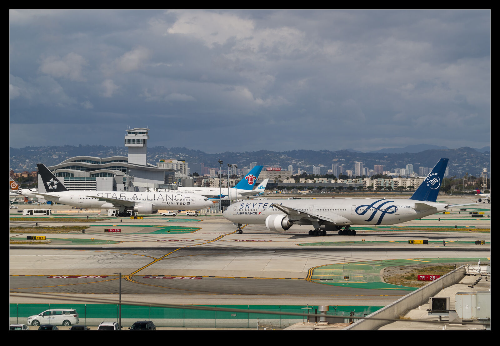 The creation of the airline alliances has allowed airlines to serve a wider range of routes than they could sustain themselves. Part of their obligation as a member of the alliance is to have some of their aircraft painted in alliance colors. Sadly, these liveries are not that exciting but I suppose it is some variety. I was quite surprised to get an Air France 777-300ER in SkyTeam colors vacating the runway at the same time a United 777-200ER in Star Alliance colors was taxiing the opposite direction. I felt like the scene for a stand off but no such thing occurred.