Tag Archives: design

Typhoon Air Data System

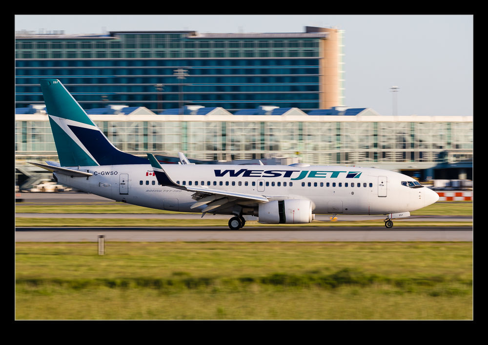
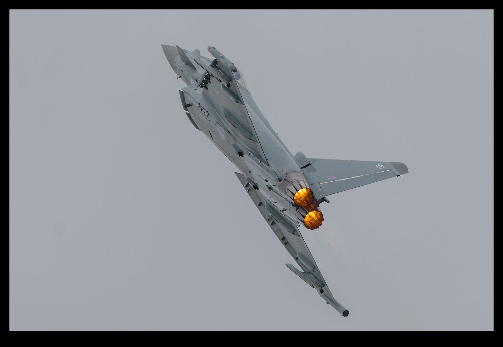
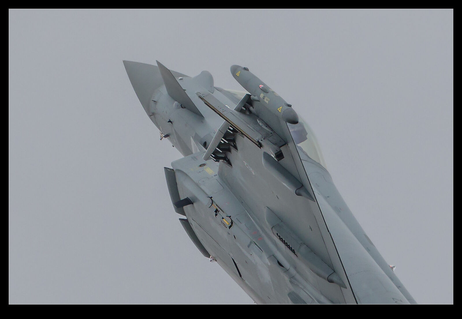
Working through some older shots for another project, I ended up looking at some shots of an RAF Typhoon displaying.  As I was zoomed in on some of the shots, it was interesting to see the air data vanes on the underside of the front fuselage as the plane maneuvered.  There are several vanes around the underside of the front fuselage and the differences between them can tell yaw and pitch angles.  In one shot when the jet was climbing straight up, the vanes are all pointing in similar directions.  Shortly before this, as the jet was pulling hard, the angle of attack was higher and the flow up around the front fuselage results in some significant differences in vane angle.

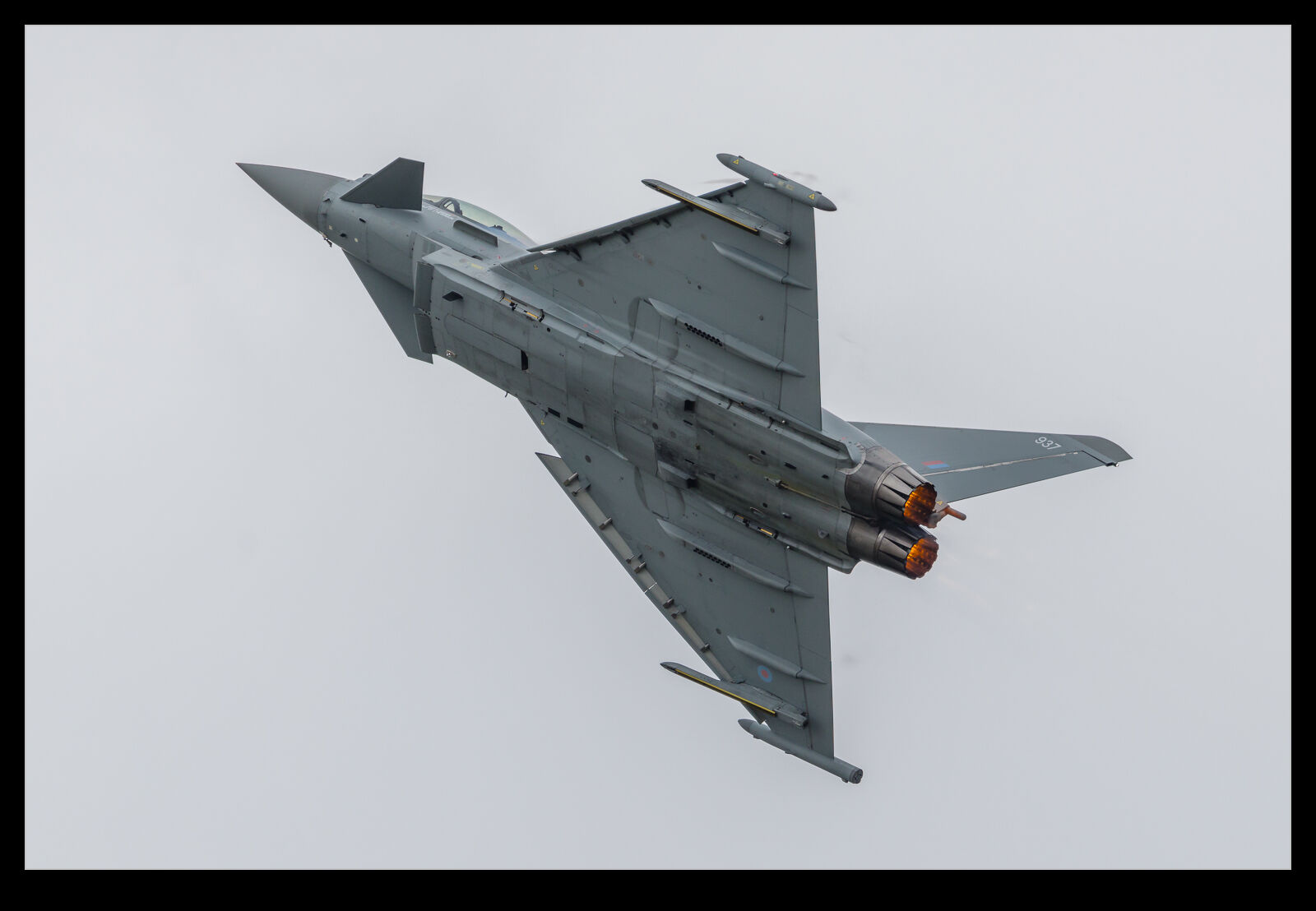
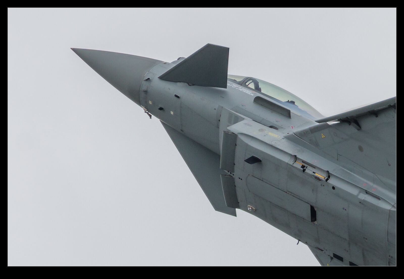
This is the sort of thing that is very important when designing and clearing a flight control system.  We had a front fuselage wind tunnel model for the Typhoon during the development program.  This was used for intake design but also for air data system modeling.  The way in which the various vanes move is vital to understanding the control law requirements.  It is also important when considering failure modes.  If one vane should fail, how much it impacts the flight control behavior and how much the system detect the failure.  Will the aircraft be vulnerable to control loss in the interim?  The Tornado did not have as complex a flight control system, but it did have augmentation of the controls and, as it rolled, you would get quite different readings from the angle of attack probes on each side of the fuselage.  How much of a difference was normal versus what was a failure was an interesting analysis problem which I enjoyed working on.  My days on Typhoon were relatively limited and shortly before first flight so I never got involved with the results of the testing program, but I do enjoy looking at the resulting aircraft whenever I get the chance.

737 Rear Fuselage Design Evolution

The 737 has gone through many design iterations.  With the introduction of the Max, the rear fuselage got quite a redesign.  The original 737 tailplane was redesigned for the NG family when it was widened.  This affected the rear fuselage a small amount.  However, there were clearly still issues with that part of the plane given the large number of vortex generators that were fitted.  These are always there to fix things that aren’t quite as they should be.

The Max has a totally reconfigured rear fuselage.  Boeing clearly decided to clean up the issues that they had been living with.  Any opportunity to reduce drag is needed when you are competing with the newest version of your opponent.  They have thinned the fuselage a lot and this is one of the easiest ways to spot that a jet is a Max rather than a previous version (the others being the engine size and the winglet type).  The APU inlet has also been relocated.

UW Campus

The cherry blossoms were the reason for us visiting the campus of the University of Washington as I covered in a previous post.  Since we were there and it was a lovely day, we also figured a bit more of the campus was worth a look.  We strolled around for a while and checked out the different styles of building that make up the university.

There is a wide variety of building types.  The oldest buildings are generally pretty nice looking.  Some of the most recent ones are also architecturally interesting.  There was some Art Deco to see and then there is a bleaker phase.  UW is a bit like other campuses I have seen.  There is a phase of concrete and plain brick.  This style was very much of its time but sadly, I don’t find it has stood the test of time too well.  The concrete particularly is harsh with the style having been to avoid making any effort to finish the surface.  They just poured at different times and the joins are left to see.  It probably seemed like a good idea at the time but I don’t care for it.  I’m sure in architecture classes they still discuss its merits but it’s not for me.

Cascades or Buckets?

Watching a bunch of arrivals at Vancouver, I got a lot of shots of aircraft reversing thrust.  Current jets fall into one of two categories.  Cascade reversers or bucket reversers.  The bucket reversers aren’t quite as obvious as those fitted to the old 737-200s where they clamped across the whole exhaust but the effect is much the same.  Bucket reversers look like they are doing the job to me.  They hang out and you can imagine the flow being turned around as they power up.  Cascade reversers are far more subtly as the nacelle translates aft and the flow is redirected out of the based of fins that is now exposed.  I imagine they are similarly effective but I have no data to back that up.  If someone knows more, please let me know as I am genuinely interested to find out.

Wingtip Treatments

Richard Whitcomb was an aerodynamicist at NASA who pioneered a number of technologies that benefit the aviation world today.  One of those was his development of winglets.  These are the wingtip treatments that improve lift to drag ratio and climb performance without significantly extending the wing.  While his work was clear, it took a while for them to be implemented widely.  Now, most aircraft involve some sort of wingtip extension.  However, the first aircraft to replicate his design approach was the MD-11.

The MD-11 had a split winglet with a larger extension upwards and a smaller one downwards.  This reflected some of Whitcomb’s original drawings.  Strangely, after this, the focus was on upward winglets only (although the Airbus approach for a while was what they called a fence on the wingtip which was something more in keeping with the Whitcomb approach).  Recently, there has been a return to the original with APB introducing the Split Scimitar and Boeing producing their own Split Winglet design (not as elegant as the APB approach in my mind.

Most airliners and many business jets now incorporate a tweaked wing tip configuration.  Maximizing the aerodynamic performance requires squeezing as much as you can out of the design within the space constraints you have.  The following pictures are examples of the different types used.

Portland Station

I took a trip to Portland for work.  Rather than drive, I took the train down.  It wasn’t as quick but it was a far more relaxing way to travel.  With wifi on the train and no need to pay attention to where we were going, I could get on with things or, occasionally I assure you, stare out of the window at the scenery.  A lot of the journey was along the shoreline and it was very pretty.  (They are building a more direct route to bypass some of this which will reduce the journey time but probably make it a lot less attractive.)

I arrived at Portland at the Amtrak station.  It was a rather striking building.  A lot of the older stations are more architecturally individual as they were built at a time when railways were competing for business.  This one made me think of a European style.  For some reason, it made me think of Germany.  I can’t quite pin down why but there was something Germanic about the design.

I arrived in good weather but didn’t have time to get a shot.  The following morning things were rather murky but, when I came back for my trip home, the skies had cleared and I grabbed a few shots.  I rather like the message on the tower.  Pretty clear what they are driving at!

What Does 40 Years of Design Get You?

AU0E1641.jpgThe Boeing 747-8 has not been a terribly successful program.  Boeing decided to update the 747 family with new engines and revisions to the wing along with a stretch to the fuselage.  The resulting jet was delayed by its own and other program issues and it came around at a time when there were few passenger airlines interested and the freighter market was taking a kicking.  The result has been anemic sales and a production rate that has steadily reduced as a result of the low demand.  However, from a technical point of view, it is a nice upgrade.

C59F2632.jpgThe wing came in for a lot of attention and was significantly redesigned.  The most conspicuous change is the introduction of the swept tips common to many Boeing designs these days.  Less obvious is that the flap system was completely redesigned.  The original 747 flaps, carried through on the 747-400 are very complex.  Sections are triple slotted.  The Boeing aerodynamicists came up with a single slot design to replace this which apparently has good performance but I imagine is a lot simpler to make and maintain.  Only from the rear on approach can you see the difference.  These shots compare a 747-400 from Air New Zealand with a Korean Air 747-8 and you can see for yourself how much simpler the new design is.

AU0E1681.jpg

The Less Subtle Bits of Dreamliner Design

AU0E2346.jpgAirliner design is a complex task with many compromises. It is not a surprise that some aspects of the design that results aren’t exactly what you would like. Today I am picking on one particular type – the Boeing 787 Dreamliner. This is almost as new as it gets in the airliner design world so you would expect it to be better than what came before.   However, having seen a number of them recently, I have been focused on two areas of the design that are rather disappointing. One is the wing root fairing area and the other is the cargo doors.

AU0E3642.jpgA nice smooth design is what the old aero guy in me likes to see and the inlets and fairings around the transition from the fuselage into the wing root are pretty ugly. They are obviously there as a result of functionality requirements but it does not look good and I imagine it comes with a drag penalty that has had to be accepted.

AU0E2336.jpgThe other area is the cargo doors. I am not sure whether this is a function of the load transfer requirements from composite to metal in the hinges but this area looks rather chunky and draggy. I know from previous projects that the nature of composites versus metals means that you can end up with some large joining fixtures to redistribute the loads but there may be other reasons I haven’t thought about. Given how smooth some metallic fuselage cargo doors are, these jumped out at me. Perhaps I have never looked closely enough at other types. Whatever the fairness of it, I just don’t like what they have done here.