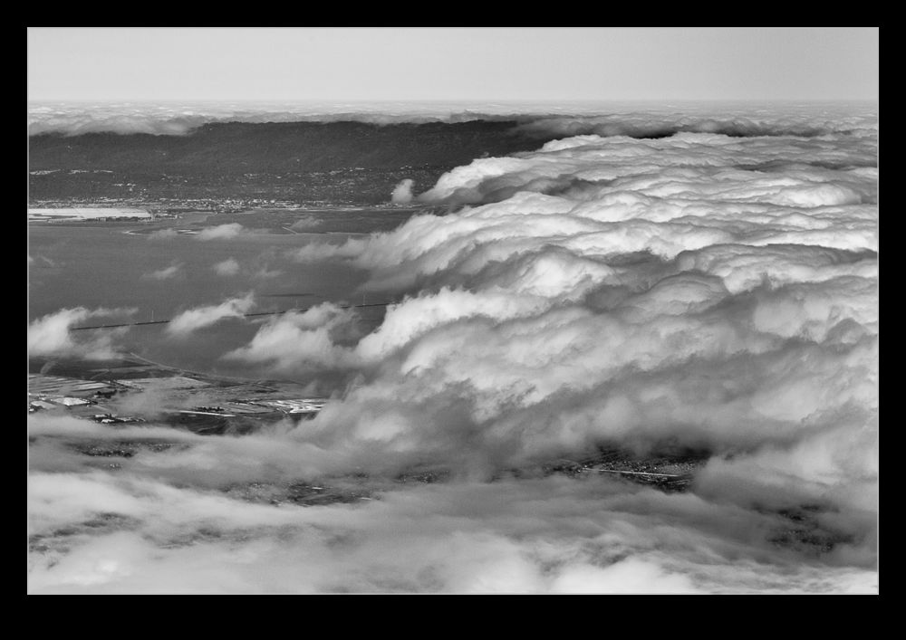
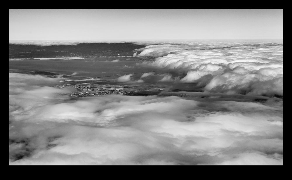
 Part of a run back into Oakland recently came across the bay but it was unfortunately covered in cloud. However, the cloud was sitting in very distinct locations with a clear edge as you headed down the bay and a similar edge near the shoreline on the Oakland side. Since we were not high above it, this looked pretty interesting. Even as I photographed it, I figured the shots would need something a bit different when I got around to processing them. Having a more contrasty look seemed the best bet and a black and white conversion also seemed likely. That is what I went with and I was quite pleased with how it turned out. See what you think.
Tag Archives: processing
HDR Panoramas
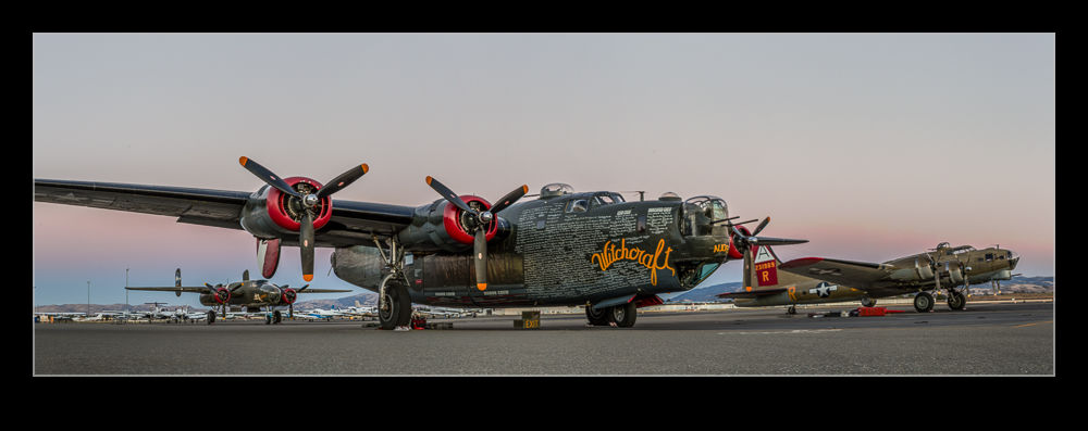 Another one of my processing technique posts today. For those of you interested in pictures of places, today will probably be one you pass on. You have been warned. This is about my first venture into the realm of HDR panoramas. I know at least one of you who knows exactly how to do this sort of thing and does it on a regular basis. You also will probably skip the rest of the post. However, you have some specialized tools for doing the job and I am playing with Lightroom and Photoshop so here is how it goes.
My initial thought having taken the shots was which order to carry out the processing. HDR first or pano first. I concluded that it had to be pano first. All of the pano exposures were consistent and would stitch properly while I wasn’t convinced that each of the pano frames would be consistent if I had done the HDR blending first. However, this left me with a second concern. Would the pano merge produce images that would align for the HDR merge. I use the pano tools built into Photoshop and, while I select the algorithm it uses, I did not have confidence that it would produce an identical alignment for each set of exposures. However, this was the route I tried.
Stitching the panos was straightforward enough. I created each of them from Lightroom and ended up with five panos with differing exposures. At this point I could have taken them directly to HDR Pro within Photoshop but, since I wanted everything to end up in the Lightroom catalog, I decided to save the files and go to HDR Pro from there.
Here I encountered my first hiccup. As expected, the panos produced were not identical. There were very close but not identical. HDR Pro only works on files that are the same dimensions. I imagine some more specialized HDR applications might be able to handle this but I was stuck with Photoshop. Since the panos were thousands of pixels across and only a few pixels different, I opened them back up in Photoshop and changed the canvas size to be identical in each case. HDR Pro is able to manage alignment of slightly misaligned shots anyway so I wanted worried about the positioning. Also, with such small changes in dimensions, I didn’t fear that I would have distortion.
With this change made, Photoshop went to work and created the HDR file. Amazingly, it worked just fine. I didn’t have any problems with the files being distorted relative to each other and it did a great job of blending them. All that was left was to crop everything in to clear up the empty corners from the pano creation (I didn’t get rid of those in the first instance since I was trying to keep the pano files identical in size and alignment) and then a few tweaks back in Lightroom had the job finished. I was pretty pleased with how it worked and, with the experience of this time, should be able to turn them around quite quickly next time.
Boeing 777-300ER Main Gear
 When Boeing launched the 777-300ER, they took the stretched fuselage of the 777-300, a model that didn’t sell particularly well and married it to the updated wing that made use of the fuel capacity of the outboard portion of the wing that had been left when the original concept of a folding wing was contemplated. The increased the weights of the jet, added far more powerful engines and, with the increased fuel capacity, came up with a winning formula that has done a very effective job of killing off the 747.
One problem that they had to deal with during development was runway length requirements for takeoff. Even with the bigger engines, the long fuselage limited rotation angles at takeoff and meant a higher takeoff speed was required which meant a longer runway requirement. Boeing came up with an interesting solution (after dumping some slightly more curious ideas). The main gear on the 777 has a triple axle bogie. Previously this had rotated about the pin attaching it to the main gear leg. Boeing’s solution was to lock the bogie level during takeoff.
The result of this is to have the rotation of the jet at takeoff to take place around the rear wheels of the bogie rather than the gear leg pin. The slight aft movement of the rotation point allows the aircraft to rotate slightly more nose up and gain a greater angle of attack. This gives slightly more lift for a given speed. This means an earlier takeoff and a shorter runway requirement.
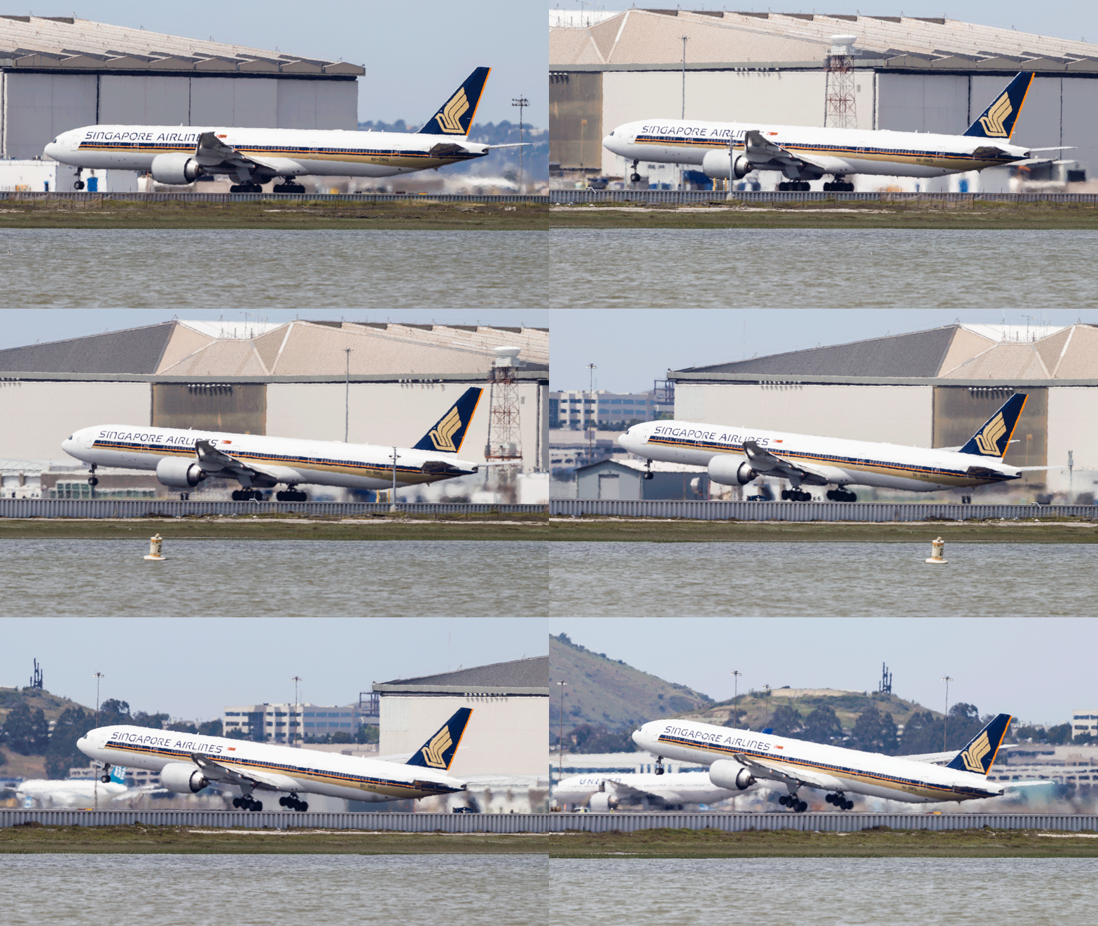
I have tried many times to witness this at work. First, it happens pretty quickly. Second, I am often in a poor position to see the rotation point. Recently I was at SFO to pick up some people. I was getting a few shots prior to their flight arriving and a Singapore 777-300ER was taking off. The rotation point is quite far away (although, if you are in the terminal, you might have a good view) and the heat haze is a problem. However, I decided to get a sequence of shots anyway. Now, how to use them.
Heat haze is crappy on stills but less of an issue with moving images so I decided to animate the sequence. I imported all of the shots into Photoshop as layers in a single document via Lightroom. The hardest part was aligning them. I started at the bottom layer and then progressively made each layer above visible. I then changed the latest top layer blend mode to difference. This makes aligning them a lot easier since everything is black unless it is different. I was focused on the gear so used that as the reference as the fuselage rotated. Once each layer was in place, I changed the blend mode back to normal and moved to the next layer up.
Once they were all aligned, I used the animation timeline to make frames from each layer (and reversed the order since every time I do this they seem to be the wrong way around). Then I could crop in to get the overall view I was after and save the file. A Save for Web allows the generation of the animated GIF and we are done. The image at the top is the final result. It does allow you to see a bit of what is going on if you look closely although it is still a bit hard given the distance, the angle to the ground and the heat haze. I guess I will have to find a location closer next time.
Updated Approach to Lightroom Catalogs
I have been a user of Lightroom since Adobe release version 1 quite a few years ago. It has been a very useful tool for me and something that dominates my workflow. In the early days, there were issues with the number of images that a catalog could have before it started to respond sluggishly. Consequently, I created a series of different catalogs for different subject areas. Military aircraft were in one, civil in another, wildlife in a third, sports in a fourth and so on. This system was fine to use although it had a few minor drawbacks in that some images would be in more the one catalog. I would import them to one and then export them to the other. However, as I edited one version, the other one did not always keep up despite saving the sidecar files to disc.
At some point, Adobe updated the functionality of the application and it was no longer so constrained by the number of files in a catalog. However, I had a series of catalogs that I was familiar with so I didn’t pay much attention to this change. However, over time, it occurred to me that I was making my life more complex than it needed to be. I could probably cut down the number of catalogs dramatically and make the workflow a bit simpler.
I decided to have one catalog for all of my aviation related imagery and the other for everything else. To do so, I created a new catalog for each of these and started importing from the other catalogs. This was not as smooth a process as you might have imagined. There were duplicate images as I knew and you could set the system up to make these virtual copies so nothing got lost along the way. However, sometimes the import did not go well. They were large catalogs coming into an even larger catalog and this caused some struggles. I had to delete and start again at some points but ultimately I got it to work. I did have to recreate some of the collections which did not transfer so easily in some cases but it is now done.
Did it make life easier? Yes, it did. Having just two catalogs is now a lot more straightforward. Do they run just as well? No. The aviation catalog does seem to be a bit sluggish sometimes. Usually it works fine but it is definitely not as responsive as the individual ones were. I shall see how this develops over time. A new machine is in the works so whether that will make a difference or not, we shall see.
Playing with Blending Layers
I have been making some shots with multiple exposures to overlay. This is something I have posted about before and the shots here are similar to those from before. However, this post is less about the shots and more about the post processing I used. Previously I opened up all of the shots as layers in a single file and then auto-aligned them. Once done, I then used the Auto Blend functionality to show each shot o the aircraft in place.
This was a lot quicker than my previous approach and was something I picked up from posts on photographing star trails. However, recently, I have not been as happy with the results as I should have been. Some of the planes, particularly those near to the edges, had some odd artifacts appearing. Also, if there were any overlaps, the blending masks could give some weird effects. Therefore, I have taken a different approach for a while. This is slower, I admit, but I think it gives a better result.
Once the alignment of the images is done, I hide them all except the bottom layer by Alt clicking on the eye beside the last layer. Then I add the next layer up back in but mask it out completely. A white brush on the mask then allows me to paint back in the new aircraft positions. This is a bit laborious but it does allow you to decide exactly what you want in and what you don’t. if one file is not helpful to the composition, you can easily ignore it.
If the layers are not all exactly aligned from shooting on a tripod, you will also get gaps at the edges on different layers. You can also fill these in by brushing in the layers that provide the right coverage and get a complete image. Once you are happy, flatten the whole thing and you are done.
Photoshop CC Shake Reduction
While a lot of people have been quite vexed by the introduction of a subscription based approach to the Adobe software suite including Photoshop, I decided to get over it and upgrade to Photoshop CC. One of the features introduced in CC is Shake Reduction. This is an effort at dealing with motion blur in images. It isn’t going to rescue a crappy shot but it is potentially able to to take an almost good shot and rescue it. I decided to experiment with it on an image I recently took.
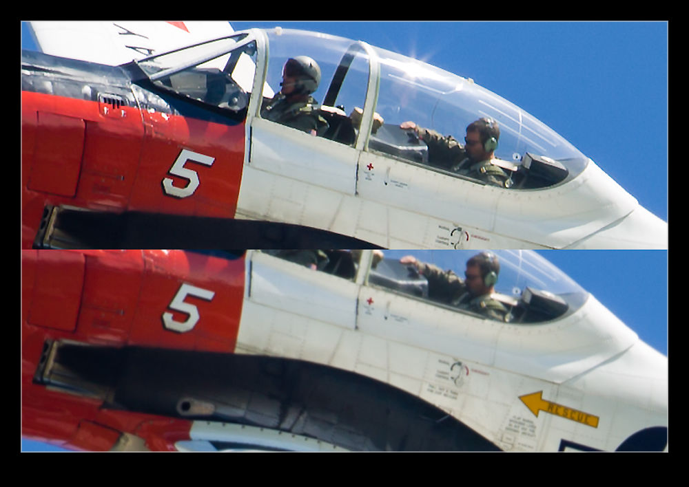 The image above is a combination of the original image without sharpening and the filtered version. (It is recommended that you turn off sharpening before running the filter or it will make things break up more.) The effect actually seems to be quite useful. I should note that I tried it on several shots and they didn’t all respond as well to the filter. However, it did make quite a good upgrade to this image. I shall potentially use this again if there is an image I really like that is not quite as sharp as I would like. Another tool to potentially use but not one I think I can rely on.
Playing with Noise Reduction
One of the biggest developments that there has been in digital imaging in recent years has been the improvement of performance in low light. A few years ago, it was hard to get a decent image at above ISO400 and much post processing work was required to try and make the images workable. Plug-ins for noise reduction were very popular. However, the camera manufacturers have been very aggressive in developing chips and processors that allow shooting at ISO levels that would have been unthinkable a while back. You hear of cameras being perfectly acceptable at ISO6400 and above.
My cameras are not the newest on the market but there are certainly not slouches in low light. However, I have never been terribly happy with the performance at high ISO settings with the image breaking up a bit when viewed up close. This is where I have to admit that I can be a complete idiot sometimes.

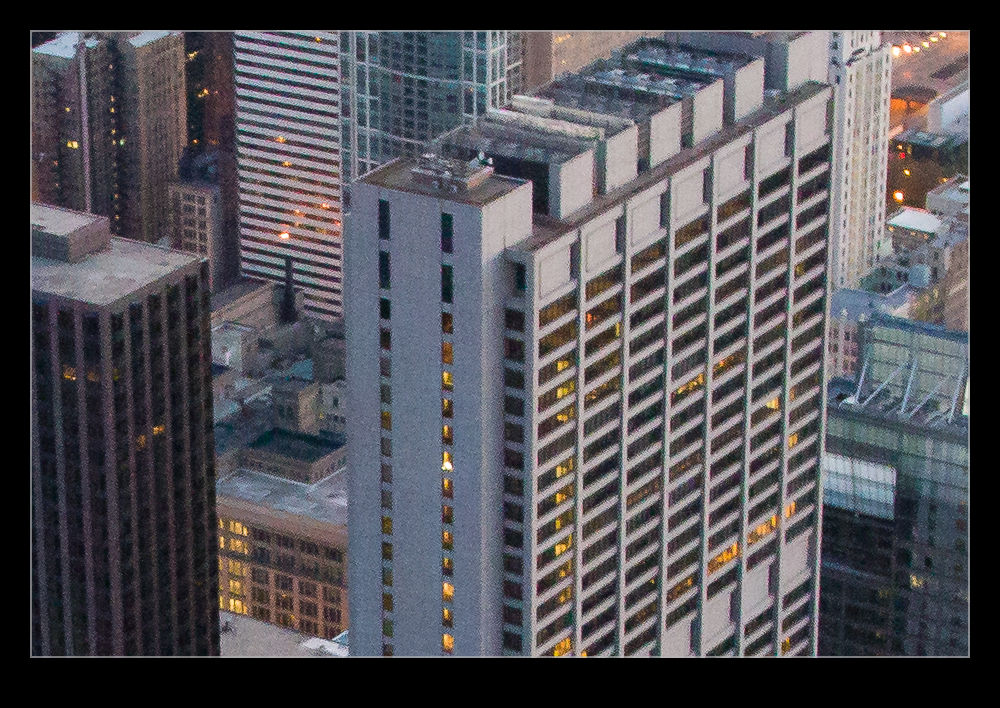 I shoot RAW all of the time and then process the images in Lightroom. I have created some presets of development settings that I apply each time I import an image and which then acts as the starting point for any additional editing. This is where my problem lies and why it has taken me so long to realize it I can’t imagine. Anyway, enough of the self-flagellation and on with the topic.
The problem lies in the Detail section of the Develop module. This is where sharpening and noise reduction are applied. I have some basic settings I start with here and, when I was importing shots taken at high ISO settings, I was not changing them. I would play with the noise reduction but things still didn’t look right. The problem was, of course, the sharpening. The basic setting I had entered was sharpening far too much for the ISO setting and was causing some odd breakup of the image. I finally realized this one morning while lying in bed – I have no idea why I was thinking of this but it suddenly came to me.

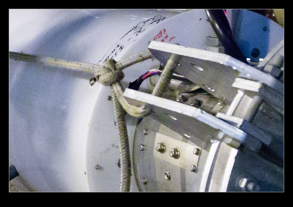 I got up and opened some high ISO images and went to the detail area. I zeroed out the sharpening and the noise reduction. Everything looked awful. Then I brought back the noise reduction and things suddenly started looking a lot better. When I was happy with the noise, it was time to bring back some sharpening. Things were a little soft after the noise was taken out so the sharpening brought back a bit of punch to the image. A tweak on the amount and opening up the radius a bit made things look good. Then a more aggressive level of masking of the sharpening and suddenly the image was looking way better than before.
When I was happy with things, I saved a new preset that was just sharpening and noise reduction and labeled it as High ISO Detail. Now I can apply it to any images that need it and be in a far better starting position for further processing. Each image will require its own approach if I am going to make more effort on post processing but I will now be starting from a far cleaner place. The samples above are comparison of approximately 100% crops with my original settings and the revised approach. Hopefully you can see the difference. It might be annoying to realize you have been missing something for so long but at least I finally worked it out!
Dust Spotting – It’s Over There!
A slight change in direction today. I am going to talk about a post processing tip that I recently read in the NAPP magazine, Photoshop User. It was a tip about how to manage dust in images. This may be something that everyone knows about in which case I apologize for being late to the game.
Dust is a familiar problem to a lot of photographers. It isn’t familiar to a lot more but it should be given the number of shots you can see that have dust spots all over them. Cameras have got better in recent years with the addition of dust cleaning functions that shake the dust off. However, not all cameras have them and they don’t always work perfectly.
When shooting aircraft against a blue sky, dust spots can be particularly conspicuous. If the area with the spot already has a lot of detail in it, the chances are you won’t notice it – particularly if the aperture is reasonably wide. In that case, you don’t really have a problem. The difficulty with dust spots is that you can get to a point where you cease to be able to see them.
Lightroom has a nice feature to assist in dust spotting. If you zoom in to 1:1 view in the Develop module and press Page Up or Page Down, you can look at the whole image to use your spot removal tool. As it moves down to the bottom of the image, another press of the button will move you across and back to the top so you cover the whole image without having to think about it. In the past, I have used this technique combined with really ramping up the Blacks slider to make the dust show up. Even then, the results are not always perfect.
The tip from the magazine was the creation of two Tone Curves to help show up the dust. I will describe the creation of the curves at the bottom since it is a bit long-winded and many may not be interested. The two curves when applied to the image create a very freaky effect. You could actually think of it as a creative finish itself but I will leave you to decide on that one. You can save the curves as a preset and use them whenever you need them. (I assume you can do this too in Camera Raw if you are using Photoshop since ACR and Lightroom use the same processing.)
The colors will be really messed up but the effect will make the dust spots really jump out of the image. You might wonder why there are two curves but, interestingly enough, some spots will show up clearly with one curve but barely at all with the other. I tend to apply one curve and run across the image, then apply the other curve and run back the way I came. It really doesn’t take very long to do.
One thing to bear in mind with this. The technique finds dust spots you had no idea were there. You will start to think that your sensor is filthy. Yes, it is – BUT – most of this stuff is totally invisible. Don’t get paranoid. You can get messed up with this. I had some shots of a vintage prop aircraft and the slow shutter speeds had resulted in small apertures and more conspicuous dust. I ended up with so many spot removal edits that the image rendering took a lot longer than normal. I suspect I had gone overboard with those shots.
Do you have to do this with all shots? Nah. However, if you are planning on doing something significant with the shots and you are concerned to keep dust spots out of the image, this could be a good way for you to find the dust more quickly and get back to what you really want to be doing rather than hunting for dust which, I suspect, is not most people’s favorite task.
Creating the Curve:
The curves are reversed versions of each other. One of them starts at 0,0 and the other starts at 0,100. Create a point at each 10% across the x-axis with each point alternating between 0 and 100. You then have a very aggressive looking sine curve (or cosine curve for the alternate I guess).
When Does Noise Matter?
I will freely admit I am as much of a gearhead as the next photographer. New toys always catch my attention and then it is a matter of time before the battle is won between my sensible side or my not very sensible side as to whether I am going to get something. The price of said item may well have an influence on which side wins that battle.
One thing that is a popular discussion for the pixel peepers is noise. Having started off with a Canon EOS10D when I first went digital and worked through a number of bodies since – none of which have left my ownership I must confess – I have seen some steady improvement in noise reduction capabilities although not always with as much benefit to the final image as I might have liked but I digress.
A while back I was shooting at the Oceana air show with two of my buddies, Ben and Simon. We had trekked down from DC for the show and were greeted by less than ideal weather. The cloud base was solid and low and a bunch of displays didn’t take place. Some did though and we still had a good day. Given the heavy cloud, though, we were struggling for light. I was shooting mainly with the MkIIN and was up at ISO 800 for a lot of the time.
The MkIIN is well into the noisy range at 800 and I knew that was the case but there was little option. A while after this show, Lightroom 3 came out and it had a lot of noise reduction built in that wasn’t in the previous version. I took a look at some of the Oceana shots to see how much better they might look. There was a noticeable improvement and I was happy.
Why am I discussing this now, over a year later? I was mulling over this topic for some reason, probably related to another acquisition decision, and I wondered how the printed version was affected by this noise. There are plenty of things that I fret over in an image when looking at it on screen, usually zoomed in far too close, that really don’t become apparent at all when printing. Is noise one of those things that looks better on paper?
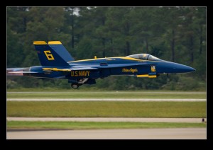 I picked one of the shots from that day to experiment with. The shot in question is this one of one of the Blue Angels taking off. Since there was the treeline behind, the gray sky was not an issue and the burner plumes show up nicely given how dark it is so I like the shot. Now to check it out on a print.
One of the nice features of Lightroom is the ability to mess with the print layouts. I made a couple of virtual copies of the image and one one of them did my best to optimize the noise reduction and on the other switched it off for the most part. On screen, it did not look great. I then set up a page in the print module with two cells right next to each other and put the left side of one image in the left cell and the right side of the other in the right cell. It looks like a full aircraft if I get the positioning just right.
First I printed it on an 8.5×11 sheet. If I look closely, I can see the divide. It actually shows more in the background than on the aircraft. It is visible but it isn’t as noticeable as you might expect. This had got my interest! What about the size of the print. I repeated the layout on some Super B (13×19) paper of the same type and printed it again.
As you might expect, this time is is a little more noticeable – hey, it’s twice the size! However, even now, while it isn’t great, it really isn’t that bad. We are talking about turning the NR almost off.
So, what do I conclude from this? Well, technology is going to always get better, both in camera and on the computer processing it and I am still going to be a sucker for a new piece of kit. However, while there is a noticeable noise difference on screen, the print is really a lot more forgiving. Maybe I should relax about it a lot more and just enjoy the shooting, even when the light is limited.
